2019 Color Of The Year: Living Coral
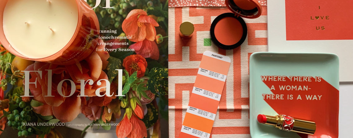
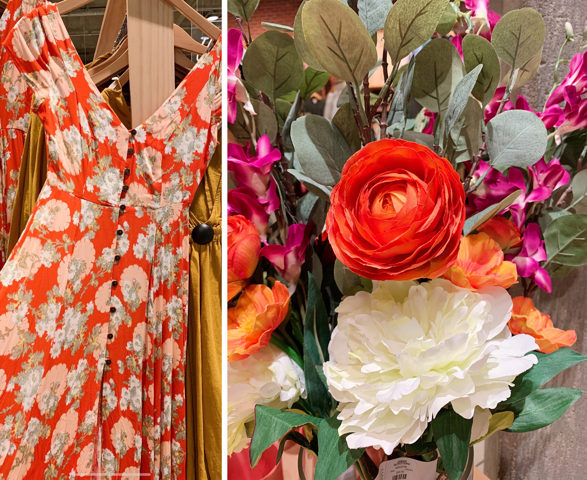
2019 is off to a vibrant start with Pantone’s color of the year; Living Coral! As we hit the malls again after the Christmas season exchanging gifts and shopping for Valentine’s Day, I’m sure you find yourself surrounded with this cheery color through beauty products, fashion, books, stationary, flowers, and of course home décor.
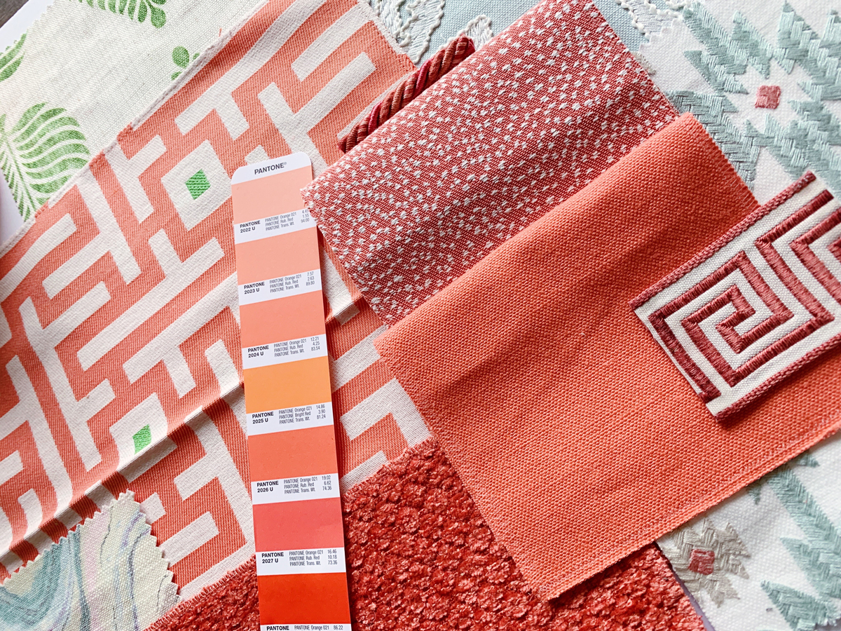
As an interior designer I see this hue as a pinky-orange with a golden undertone and little punch of red to jazz this color up! Living Coral makes me want to book a flight, check into a luxury resort, and sip on a Peach Bellini while laying on a white sandy beach. Harsh reality, it’s only February. In the meantime, I have been having exploring with textiles inspired by this animated color and came up with two very different fabric schemes using the same bold color that will add comfort and warmth that exudes a playful elegance to any interior.
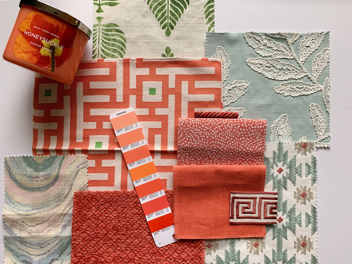
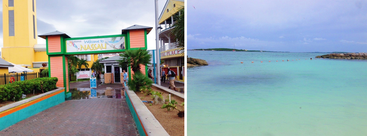
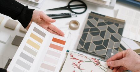
Taking me back to my poolside resort days, I was inspired to pair Living Coral with seafoam blues and greens, a touch of pink, texture, patterns, and a classic Greek Key motif for added impact. The aqua blue and green tones soften up the energizing color adding balance to your home or commercial interior. This palette can be incorporated through custom drapery, table top decorative accessories, custom upholstery, and accent pillows with a fun trim (attention to detail is key!) Nature is always my best source of inspiration. I often go through my camera roll and pull travel images for color inspo. This color palette reminds me of my brief days in the Bahamas a few years ago. Definitely giving me summer vacation and cheery vibes, very Bahama-Mama!
Bahama-Mama fabric scheme
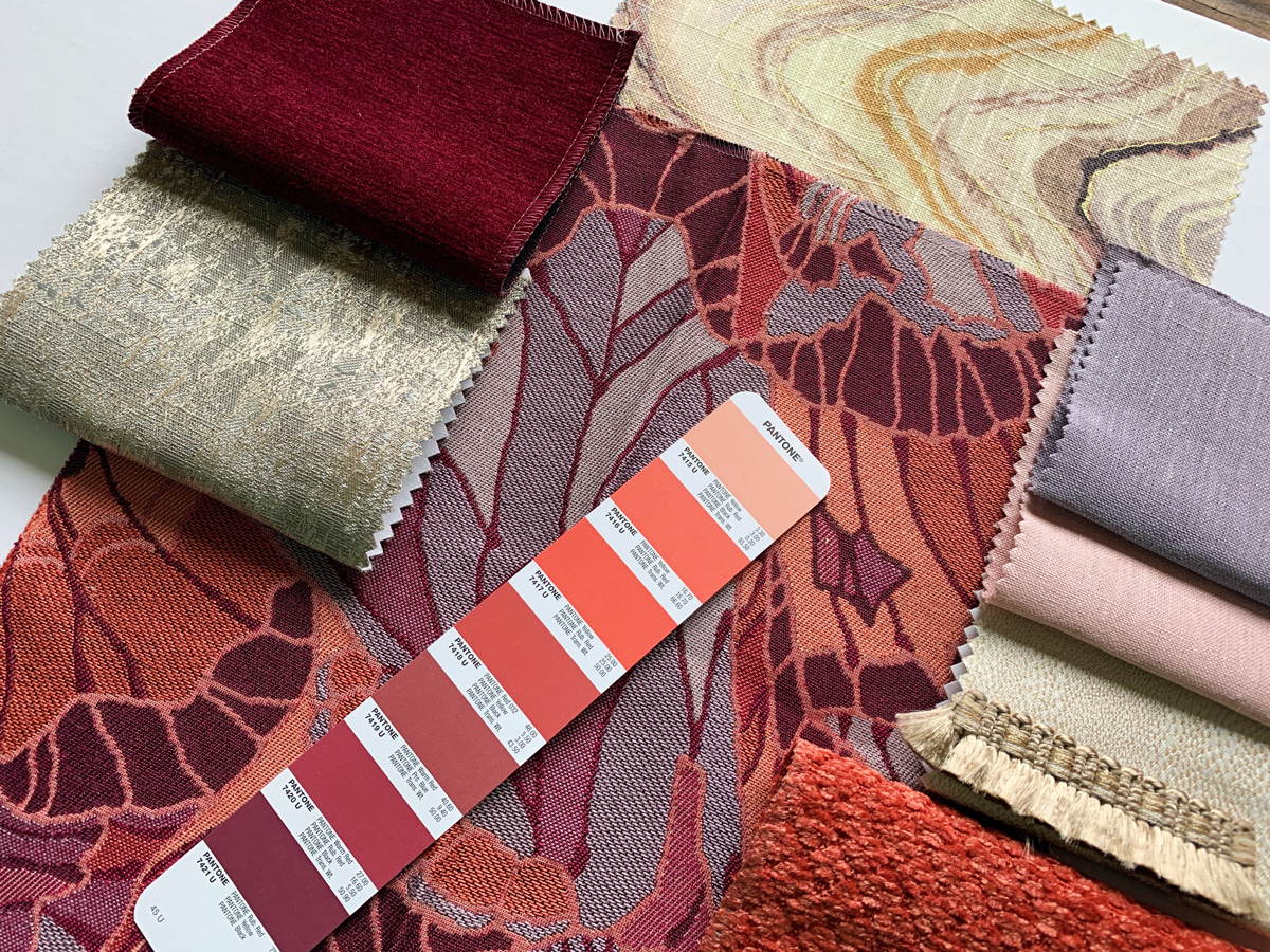
If bright pops of color aren’t your cup of tea for interior design<, I’ve also used Living Coral in a moodier sophisticated color palette; pulling in mixed silver and champagne tones, crimson, a darker tone of coral, lavender, and a touch of blush. These textures, accent trims, and saturated hues will set a romantic atmosphere for a lavish formal living room or bedroom, and an upscale hotel lobby. Balance, texture, and scale of patterns are key elements to consider when selecting a bold color scheme like this one. Starting with a few throw pillows and table top accessories is an easy and safe way to determine if this is the new color scheme for you to indulge in.
On a lighter note here are images of my travels to the Bahamas and Key West from a few years back. Living Coral took me back to my memories in paradise and inspired me to write this blog post. Obviously coral has always been one of my favorite personal colors, but what I love even more is my YSL beauty rouge volupte shine in color Coral Domain #12. I’ve been using this shade for a long time, as you can see me wearing it with a glass on champagne on hand of course!
Living Coral has inspired the interior design community, no more boring beiges and greiges! It’s time to really have some fun and indulge with color, pattern and textures! Contact STUDIO 9 if you would like to dive into any of these fabric schemes and see them come to life in your own home. Not a fan of coral overall; no worries- our design team can whip up any mood that personifies your taste!

